Helping shoppers discover their perfect bra
6 weeks
Design Lead, Product Manager, Customer Support, Engineering
A bra for every shape and size
Increasing customer conversion was one of the main problems we set out to solve. Data indicated that customers browsed through the extensive catalog for prolonged periods of time, but would not complete their purchase. After some initial research, the team decided to focus on improving the product filtering experience for customers.
With this in mind, we spent time ideating and testing various product filter patterns at different levels of fidelity to craft an experience that felt intuitive and efficient, with the objective of lifting conversion rates.
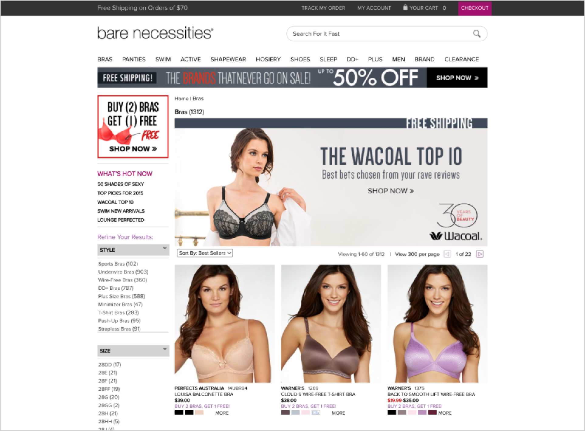
Way too much scrolling
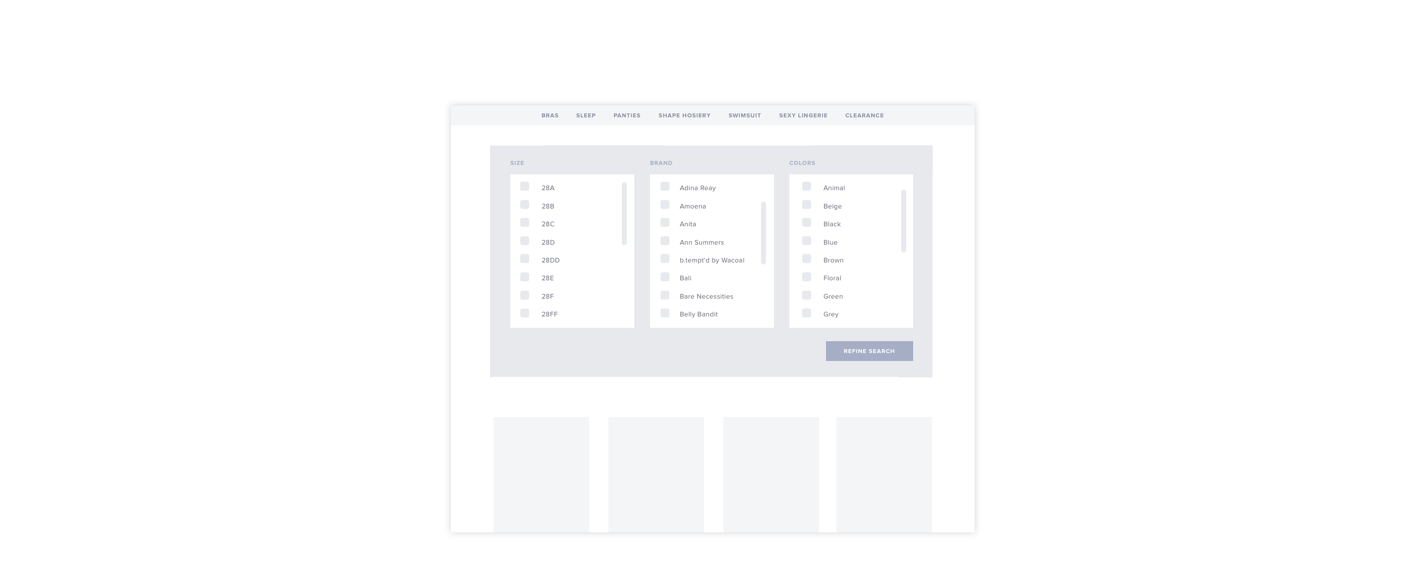
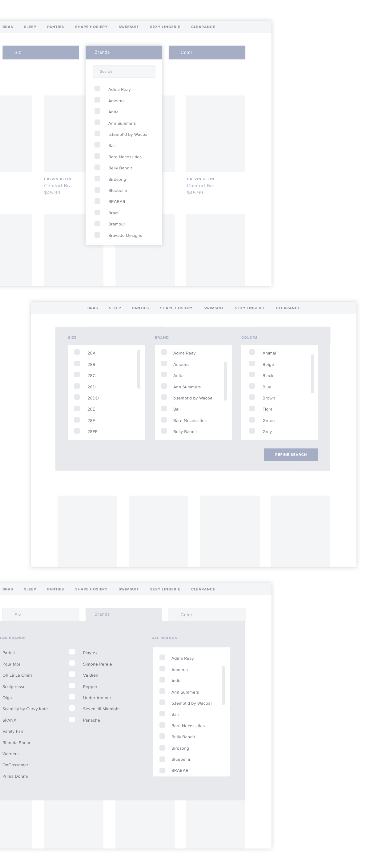
Following a product audit, interviews, and journey mapping, we explored different product filter patterns used by the top brands in retail. After talking through the tradeoffs to each filter pattern, Bare Necessities narrowed down the product filters to two types: the horizontal toolbar and the traditional sidebar. To validate the best solution, we put together several rounds of clickable prototypes to gather user feedback.
The first round of testing was made up of tasks for five users. As they attempted each one, we documented their responses, gut reactions, and moments of frustration. We closely observed their clicking patterns and gave special attention to the things that confused or surprised them. These moments held the opportunities for improvement.
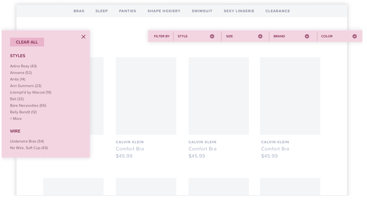
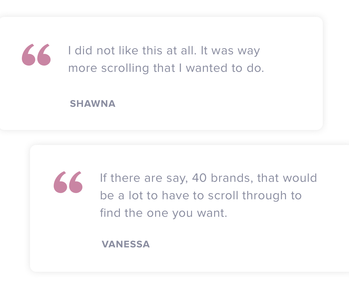
It was quickly evident that the horizontal toolbar was best suited for customers. The alternative traditional sidebar was too cumbersome and created barriers in the shopping experience.
For example, when customers accidentally scrolled outside of the panel, it would shift the entire screen. This friction resulted in user unease, jerky interactions, and a poor shopping experience. This, along with several other key insights, gave us the confidence to move forward with the horizontal toolbar and abandon the traditional sidebar.
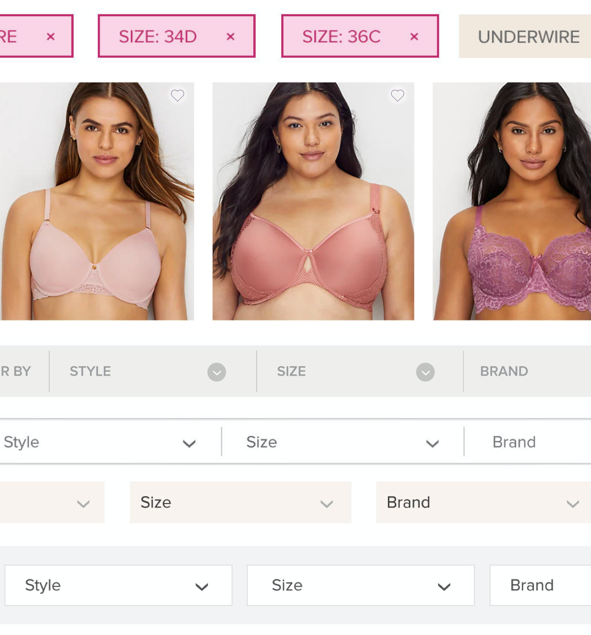
Striking the right balance
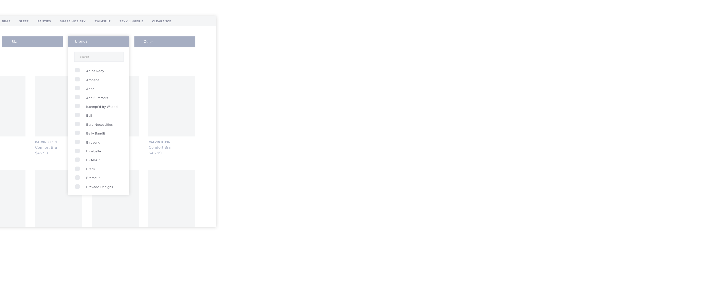
The visual treatment of the product filter was informed by the brand and user feedback. In previous user tests, we watched customers entirely miss the product filter, and noted the treatmeant was too subtle and tucked away. The new iterations made it much more prominent in its visual design, placement, and use of space. Crafting something elegant for the customer that balanced utility without disruption was our goal.
Filtering behavior
Great attention was given to how the product filter behaved. We explored multiselect for customers who were between sizes, or wanted items that are blue or black. We also looked at the order of categories. For example, do customers filter first by size or brand? By getting these variables right, we were able to save customers time and provide them with results for faster decision making.
Narrow down the options
We additionally studied how customers shopped with long-listed categories. Should items be alphabetized, or displayed by popularity? Which methods allowed for best readability?
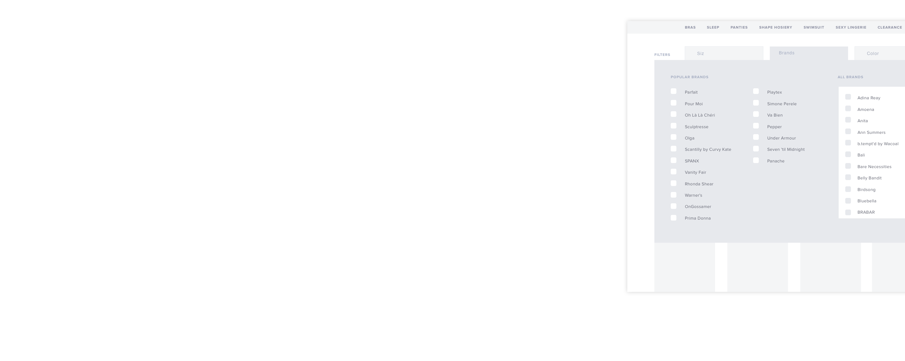
During the prototyping phase, we gained insights from an interesting iteration with a mega-dropdown design that split results into two columns. One column listed popular brands, while the other contained an extensive list of brands. This allowed for brand discovery while still providing the flexibility to search or scroll. Prototyping through these iterations and validating often allowed us to continously refine the user experience and ensure that it aligned with customer behavior.
Shopping from the comfort of home
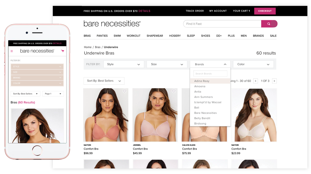
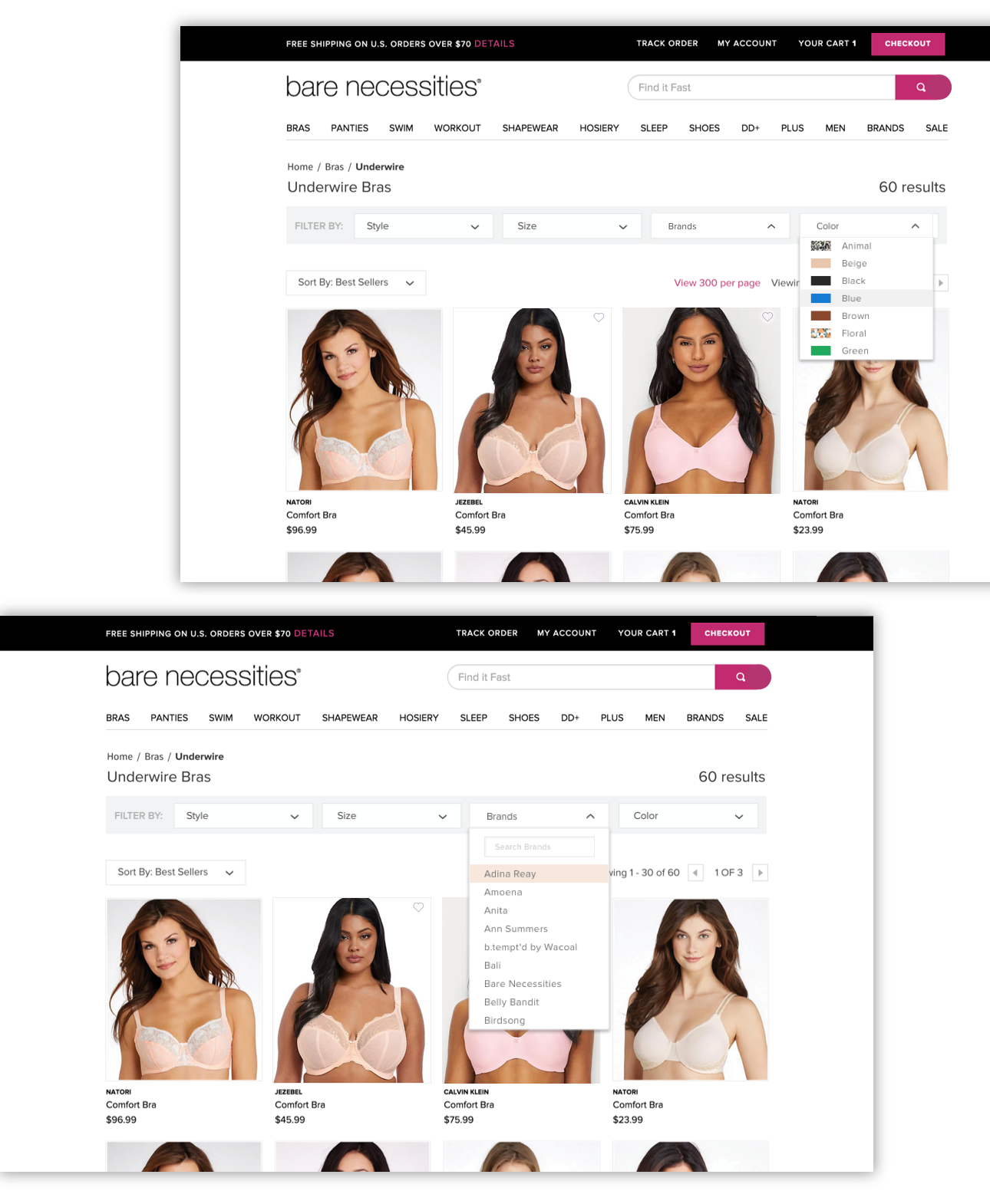
Our final product filter was an elegant, easy-to-use horizontal toolbar placed subtly at the top of a product gallery page. Brand, style, size and color, categories that most customers use to make buying decisions, were placed in individual dropdowns.
This treatment provided another key benefit: more edge-to-edge real estate for product discovery. With this design, customers could browse across the page instead of scrolling down for more products. By combining thoughtful categories and focused interactions, we created a convenient shopping experience for customers to enjoy from the seat of their home. To this day, Bare Necessities has continued to maintain the horizontal toolbar in their ecommerce site.
Setting user tests up for success
Concept tests, user flows, and user interviews with were all leveraged to give us a wide array of data to pull from. The ability to dive deep into moderated testing taught me valuable dos and don'ts for successful outcomes.
One hiccup we experienced was assuming our users would be familiar with a Macbook. The lack of a mouse and the learning curve of a trackpad made for users disoriented. Clearly defining expectations, helping users feel safe and comfortable, and recreating a familiar testing environment all impacted our findings. With each new user, we quickly improved the set up to ensure the next test would be better than the last.


