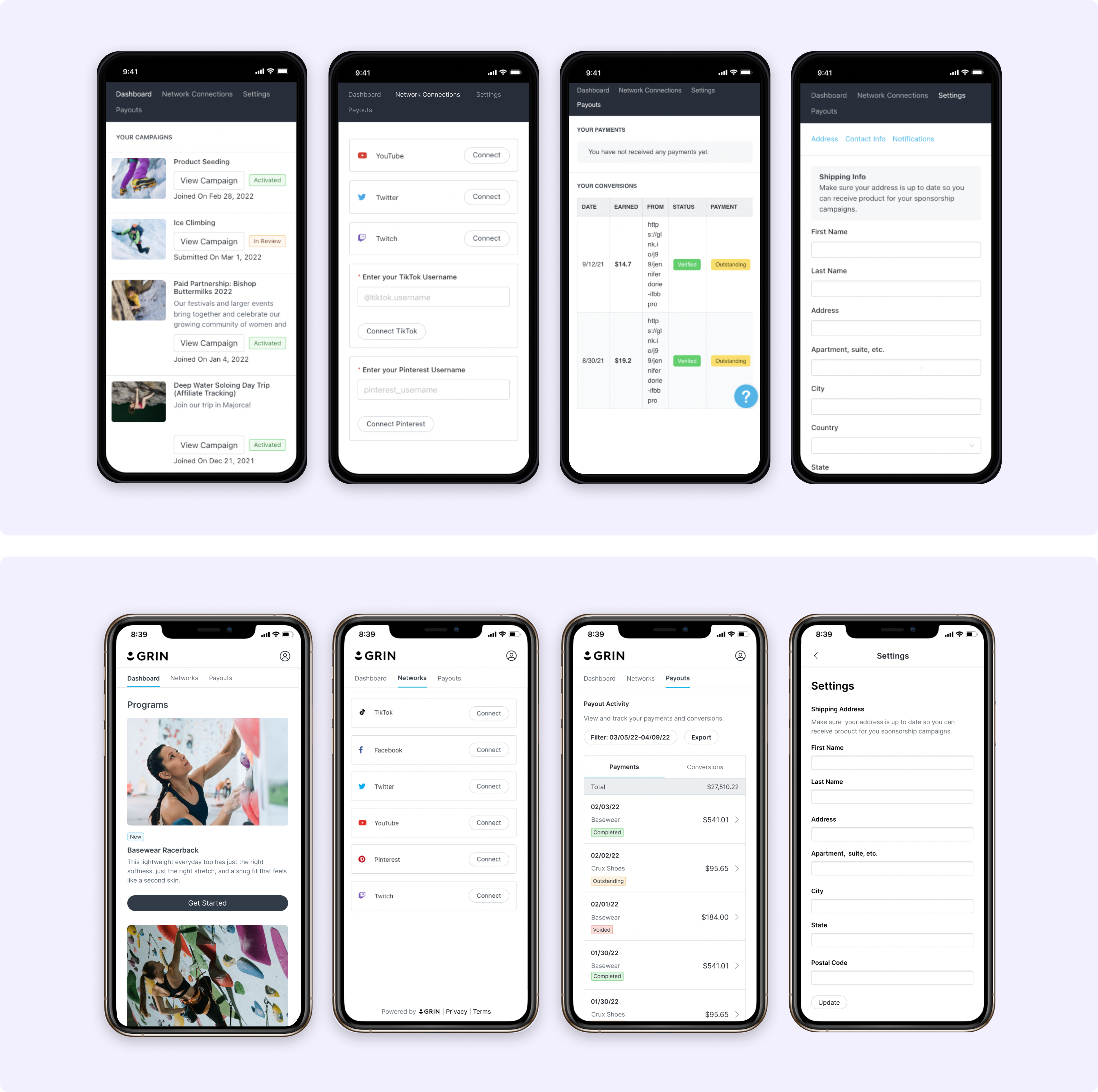
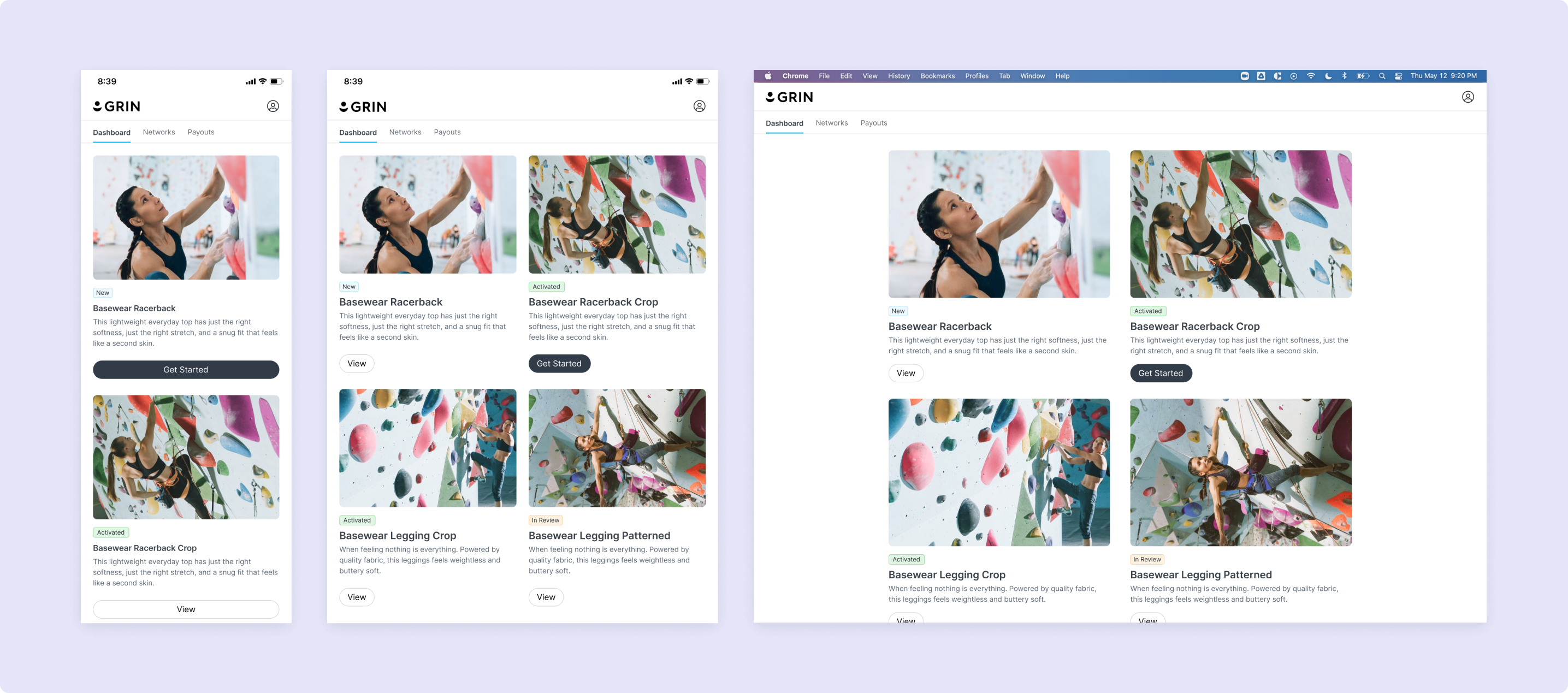
GRIN's Creator Live Site
6 weeks
PM, Engineering, Product Marketing, Technical Writer, Customer Success Teams
Desire for a better user experience
Through our Customer Insights project, an effort to gather specific feedback and sentiment around our products, we discovered that 35% of our surveyed customers expressed the desire for a more modern, branded, and intuitive Live Site.
This feedback highlighted the critical role of the Live Site and the ways a negative user experience could harm the brand's reputation. Additionally, it impacted creator retention and engagement, discouraging them from using the portal to streamline their collaborations.
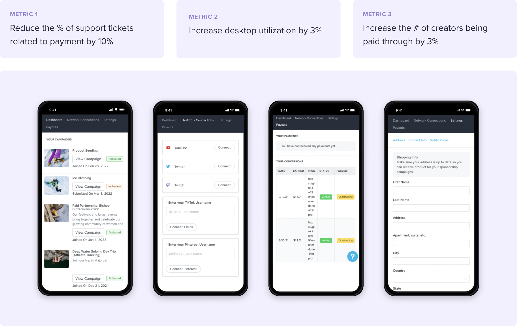
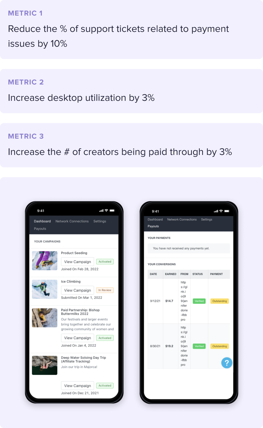
To address this, we aimed to create an updated, easy-to-use, mobile-first experience, something very crucial to ensuring more seamless campaign partnerships. Our success metrics included:
Gathering the right product signals
To gain a deeper understanding of the user problems, we collected additional data to validate our findings and further our knowledge.
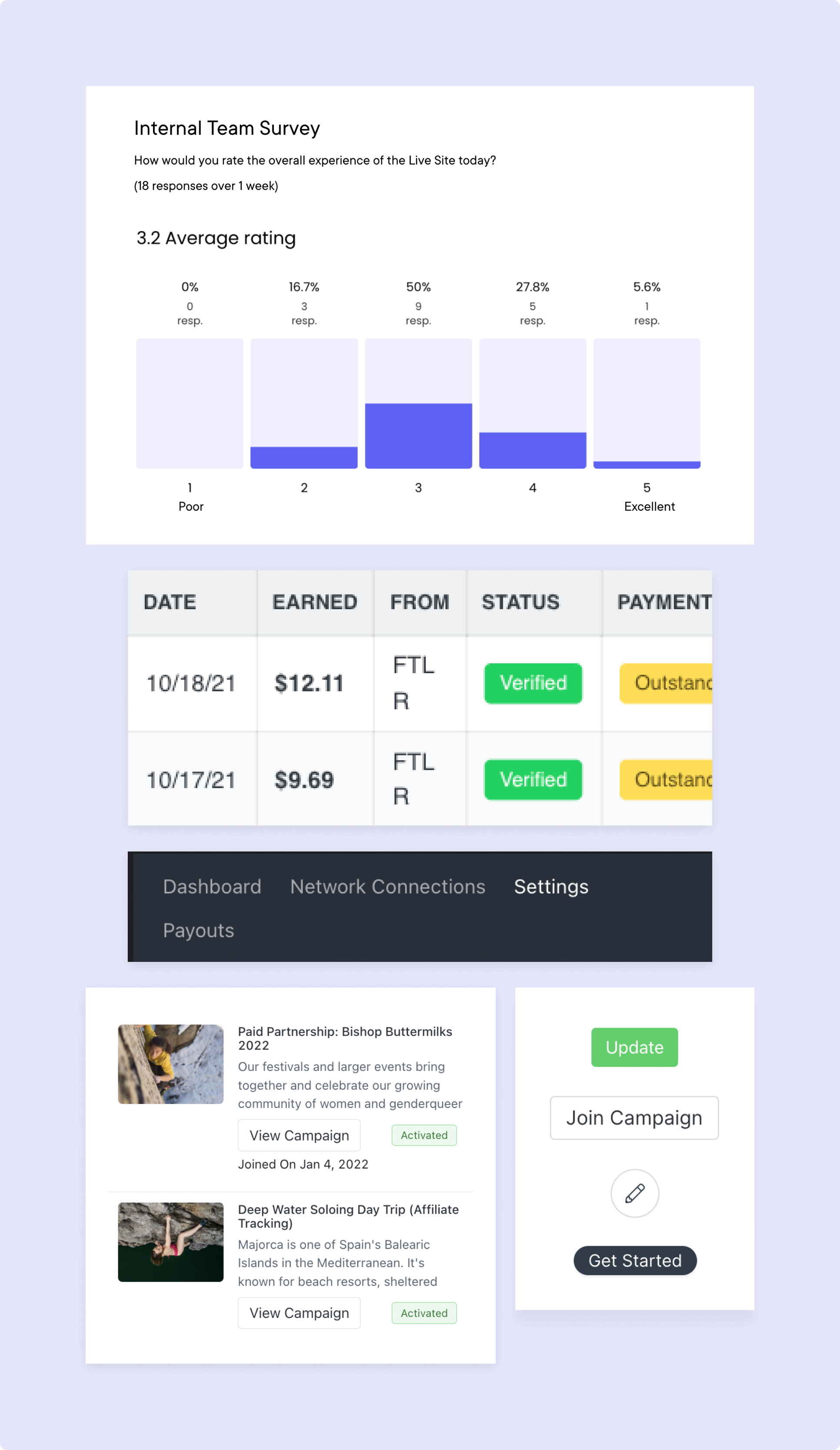
Through a comprehensive product audit, analysis of support tickets, internal surveys, video replays, and more, we discovered the following key insights: 43% of all creator support tickets were related to payments, 41% of dead clicks were related to mobile navigation, and several customer feature requests for desktop support.
Possibilities of a new navigation
During our product audit, we discovered several usability issues with the navigation, including text wrapping beyond a 427px breakpoint, and a high frequency of dead clicks (when a user clicks or taps but no changes to the screen occur; this indicates user desire).
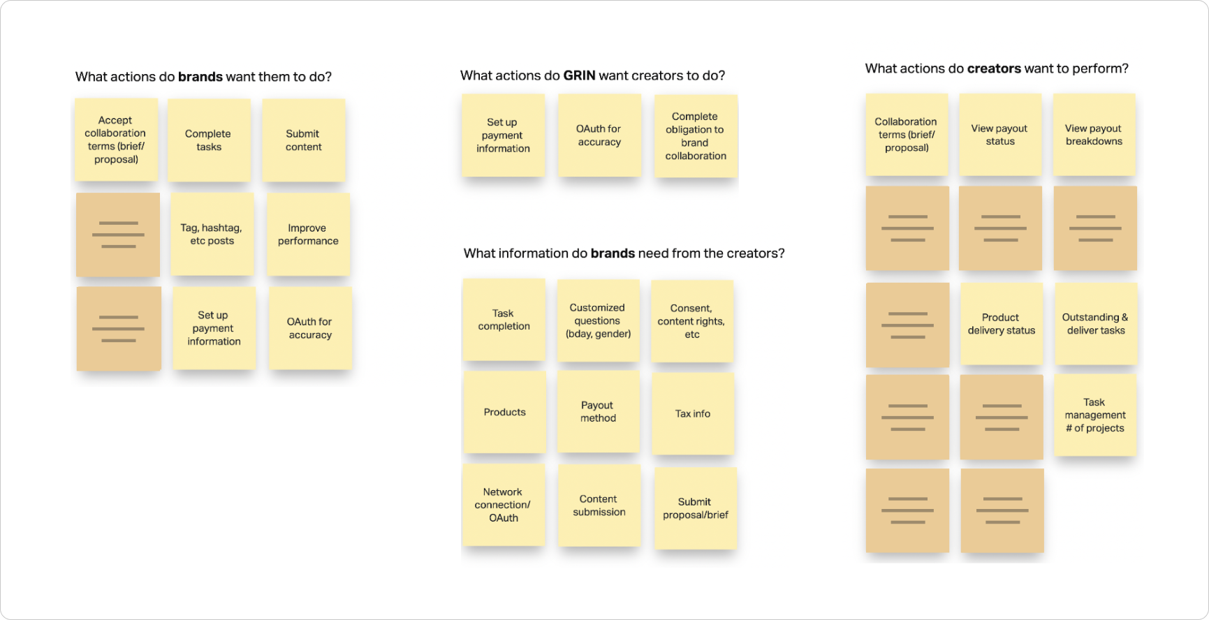
To help us explore different solutions beyond simple usability fixes, we took a step back and conducted a cross-functional exercise to examine the navigation experience and information architecture more holistically.
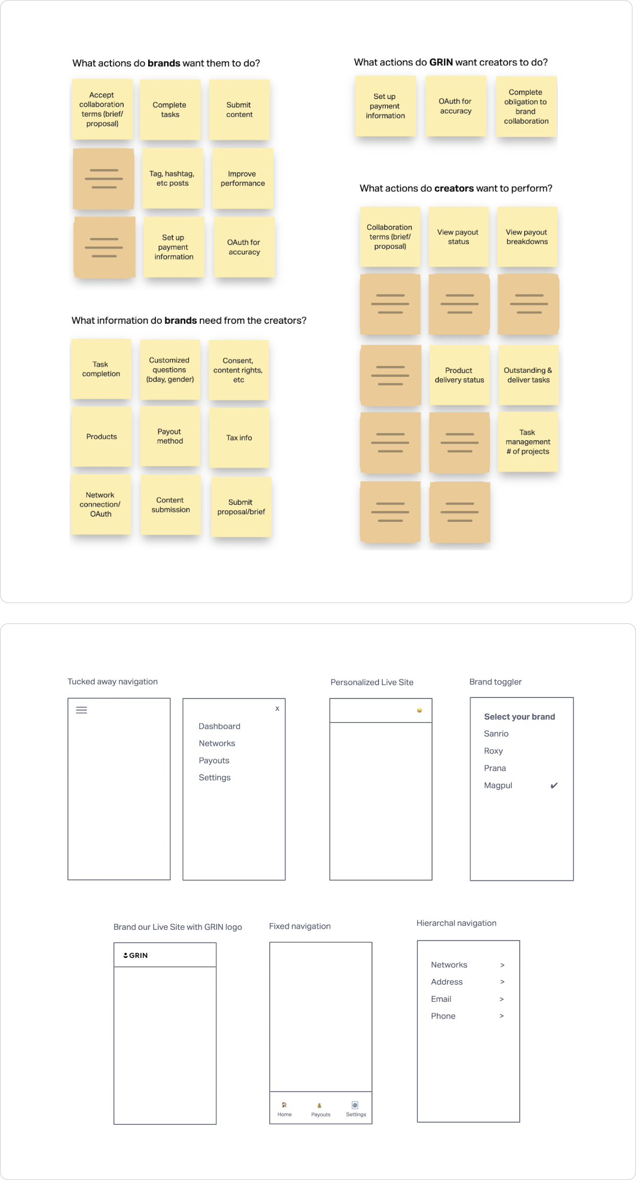
Accessing impact and effort
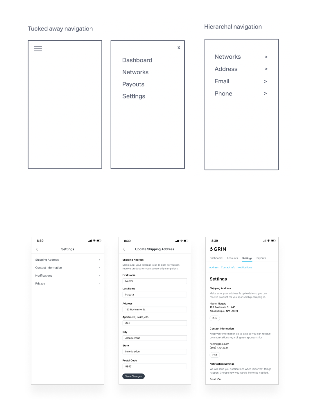
Based on cross-functional exercise and customer feedback, we created low-fidelity wireframes to improve navigation for the short, medium, and long term. Working closely with engineering, we evaluated each approach and decided to prioritize the smaller, more focused enhancements to address usability issues.
This near term solution included a more minimal top header and navigation to allow for easier branding, and refining the content and visual design to reduce the text wrapping and dead click issues. Mid and long term ideas were added to our initiative backlog for further planning, discussion, and validation.
Show them the money
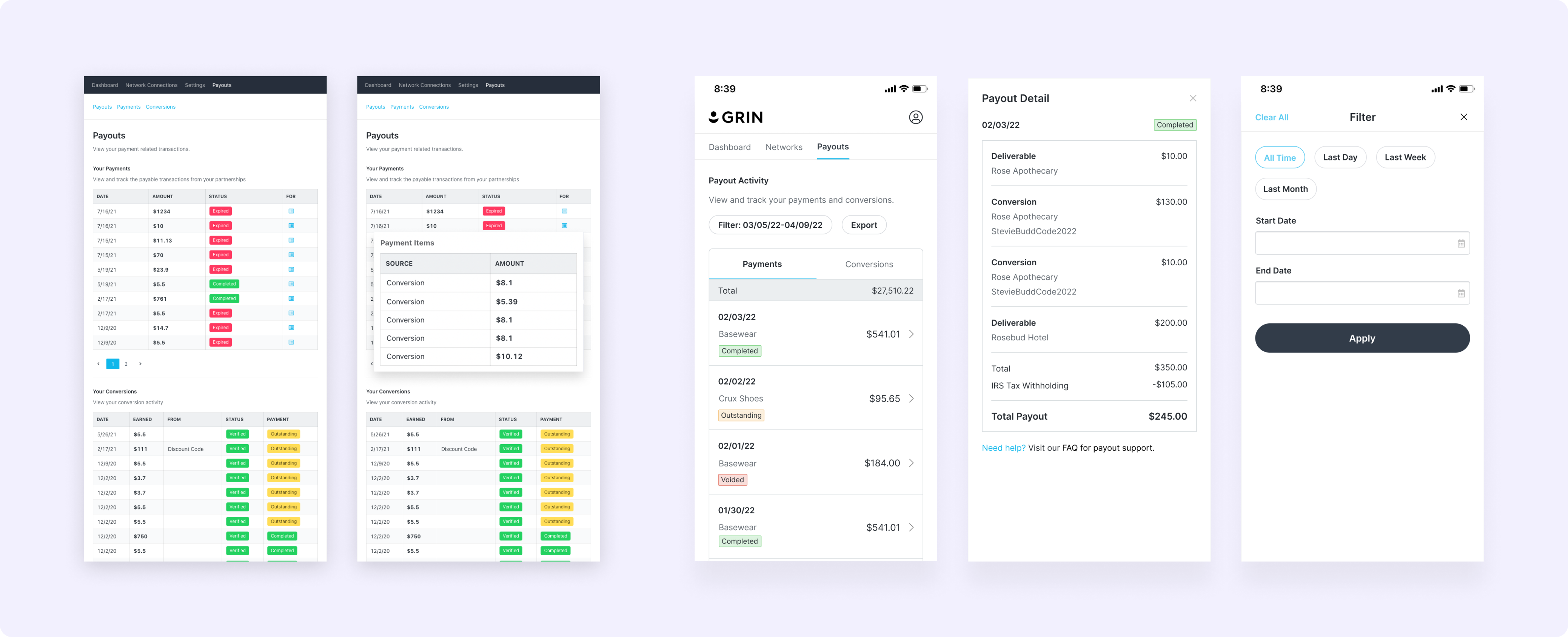
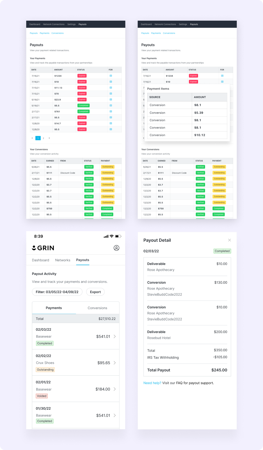
The payouts page was causing a significant number of support tickets, accounting for 43% of all creator tickets despite being limited to a single page. This was due to the page's flat information architecture and lack of payment metadata. To address these issues, we first improved the presentation of payment information by moving away from tables to a listed view, similar to a bank statement. This made payment activity easier to navigate and more familiar for users.
After conducting user testing and validation, we launched phase 2 and 3 enhancements, which included activity filtering and exporting, providing creators with more control over their payment activity and the ability to cross-reference it with their preferred tools. These updates led to a 40.70% decrease in support tickets, reducing frequent support intervention, and a 4% increase in payments made through GRIN in the first three months post-launch.
A great experience, on any device
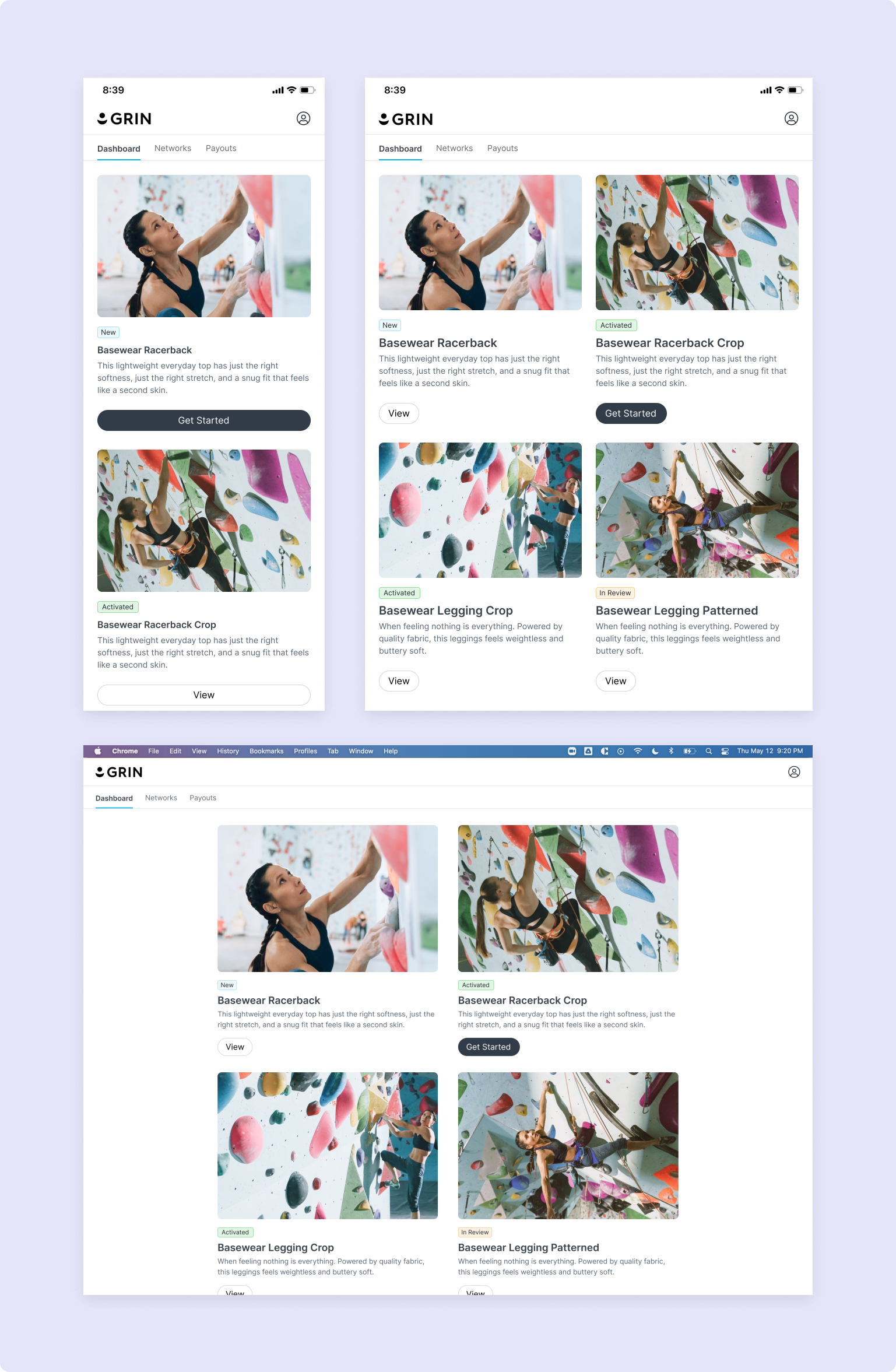
To provide a seamless experience for creators, we aimed to ensure that our platform was not limited to just mobile, but also provided a high-quality experience on desktop and tablet devices. We recognized the importance of allowing creators to access the same content and functionality on all devices, without compromising on usability or clarity. This was especially important for creators who primarily work on desktop, such as photographers, bloggers, and streamers with audiences outside of social media platforms.
With this enhancement, we were able to provide a consistent experience across devices creators on the devices they use most often, we were able to increase desktop utilization by 4% in the first three months post-launch.
A more seamless experience
Our Live Site navigation and payment improvements delivered a modern, intuitive web experience that felt familiar and approachable for creators. In addition to the outcomes mentioned earlier, we also saw a 5% increase in weekly active users/monthly active users and the ability to support an increased traffic of 15.38% as a result of this project.
Since launching, we have continued to iterate and improve our product based on user feedback and data analysis. Our team has implemented several new initiatives as a result of our findings, such as the ability to quickly toggle between brands and viewing conversion and performance activity on the Live Site. These efforts have provided us with valuable insights that will help shape our long-term product vision and ensure that we continue to meet the evolving needs of creators and brands.
